Interactive Web Charts 101 for Programmers
Most Plotly.js guides teach beginners. This one teaches experienced programmers unfamiliar with Plotly.js.

This article is part of my web development series 'webDEV101'. You can read the whole series here:

This article explains how to use the Plotly.js library to graph charts in runtime. A basic familarity with HTML and Javascript is required.
Web charts?
Statistics is the grammar of science.
- Karl Pearson
How do you integrate charts into your website?
Of course, you can lazily put the data in a spreadsheet, graph it in the application and export it as an image. However, not only will there be zero interactivity, but it will also be a pain in the arse to keep data up-to-date. You must keep track of a gazillion spreadsheets, pull them out periodically to update the data and re-export the images to replace the live ones.
Or, you can pay someone to do it for you, handing your data over to various third-party services, who will graph it for you and spit out some HTML for you to paste into your website. However, in addition to the data security implications, it is adding needless complexity to your website. As long as you know Javascript, it is so simple to visualise the data yourself with various open-source Javascript libraries and integrate visually appealing, interactive charts into your website directly. Why bother with proprietary, potentially costly data-hosting services?
Plotly.js
There are currently three widely used graphics libraries in Javascript:
- Chart.js: the simplest, supports standard no-frills charts of various types, with room for personalisation. Easy to learn and implement.
- D3.js: the most complete, supports numerous chart types with extensive customizability. Steep learning curve.
- Plotly.js: based on D3.js and Stack.gl. Much easier to learn than D3.js and offers more flexibility than Chart.js. Plotly is also supported in other programming languages, such as Python and R.


Chart.js, D3,js, and plotly.js Image credit: Wikipedia Commons
This tutorial focuses on ploty.js.
Installation
You can choose to install Plotly via npm:
npm install plotly.js-distOr, simply use a CDN link, courtesy of internet security firm Fastly:
<script src="https://cdn.plot.ly/plotly-3.0.0.min.js" charset="utf-8"></script>
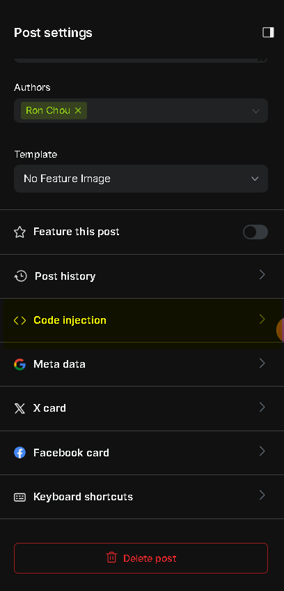
That goes in your website header. If you are using a content management system (CMS), such as Ghost, use header injection.

Basic charts
Plot.js supports more than 40 chart types. You can view dedicated tutorials on each type on the official website:

I will demonstrate my two favourite types, pie and scatterplot/line. The code snippet for the former takes the bare minimum approach, while the latter explores more aesthetic options.
Pie chart:
<div id="OS-market-shares" style="width:100%;height:60vh;"></div>
<script>
  var data = [{
    values: [72.17,15.42,4.03,2.27,6.11],
    labels: ['Windows', 'macOS', 'Linux', 'ChromeOS', 'Others'],
    type: 'pie'
  }];

  var layout = {
    title: {
      text:  'Desktop OS Market shares as of Feb 2024'
    },
    autosize: true
  };

  OSMarketShare = document.getElementById('OS-market-shares');
  Plotly.newPlot(OSMarketShare, data, layout);
</script>
The Plotly.js syntax is simple and intuitive. The code is almost self-explanatory.
Scatterplot/line:
<div id="Puberty" style="width:100% !important; height:70vh !important; background-color:rgb(0, 0, 0) !important">
  </div>
  <!-- the `!important` flag ensures those CSS style overwrites my sitewide default -->
  <script>
    var trace1 = {
      x: [17.0, 22.0, 27.0, 32.0, 37.0, 42.0, 47.0, 52.0, 57.0, 62.0],
      y: [12.7, 13, 13.3, 13.4, 13.8, 14.1, 14.8, 15.5, 15.9, 16.3],
      type: 'scatter',
      // line graphs are still made with the scatter type. Just specify with mode: 'lines+marker'.
      mode: 'lines+markers',
      line: { shape: 'spline' },
      text: Array(10).fill('Likely from improved nutrition!')
      // constructing an array of identical hover text descriptions, so when users hover over any data point, this description is displayed.
    };

    var layout = {
      title: {
        text: 'Average age of having first period in South Korea',
      },
      autosize: true,
      xaxis: {
        title: {
          text: 'Age in 2012'
        }
      },
      yaxis: {
        title: {
          text: 'Average Menarche Age'
        }
      },
    };

    var data = [trace1];
    var graph = document.getElementById('Puberty'); //this tells Plotly where to inject the graph
    Plotly.newPlot(graph, data, layout);
  </script>
Survey done from 2010-2012. Data source: USNIH
Note: As seen, Plotly.js displays charts by rendering diagrams in runtime and inject them to a chosen division via Javascript. Therefore, it may not be appropriate for display of raw data with large amount of data points. In these cases, alternative methods, such as D3.js, should be explored.
Remarks
If you followed this tutorial, you should now be familiar with Plotly.js syntax and basic methods. here and play around with it! GitHub Copilot can also help check your code and answer specific questions you may have on Plotly.js!


